By Donn Goodman
Welcome back, subscribers and other readers. We all hope you had a relaxing and enjoyable Fourth of July holiday. As I said last week, we can never take our freedom for granted. As you get older, you realize and appreciate this more and more. God bless America… the land of the free!
Jumping right into our weekly perspective, it has been surprising to look back since the start of 2024. I am not sure that many Wall Street pros got the markets right. Most, I believe, were much more conservative and projected we might see a 10-15% total return for all of 2024.
Should we encounter a severe slowdown or even a recession, the S&P 500’s return may be less than its current level of up more than 16%.
As we will share with you later in this outlook, one of our most dependable sources (who has been more accurate than most this year), Ryan Detrick of Carson, provides a few charts and statistics that suggest we will see more all-time highs in the S&P 500 for the remainder of the year and that we have more upward price appreciation to go.
Last week, we provided our readers with the different market index returns. As you would expect, the NASDAQ was the real winner, although the S&P 500 was not far behind. If you have not yet read last week’s Market Outlook, you can do so here.
The major winners and biggest contributors to the S&P 500 for the first six months of 2024.
I have provided a table below (courtesy of The Motley Fool) that shows the five biggest individual contributors to the S&P 500 from January 1, 2024 to June 28, 2024:

The numbers above are staggering. Most of us cannot even fathom what $1 trillion looks like, so the idea that these five companies increased their aggregate market cap by $3.66 trillion is really quite hard to grasp.
The S&P 500 produced a 14.5% return for the first 6 months of 2024, so these 5 companies produced 63.2% of that return. In other words, those 5 companies helped contribute 9.16% of the 14.5% return of the S&P 500.
Without those 5 company’s contributions to the stock market, the other 495 companies only produced a return for the S&P 500 of 4.84%. Consider the fact that half of the S&P 500 companies (250 or more) had little to negative returns for the first 6 months of the year.
The Sector (Modern Family) winners were…
Given the heavy dose of technology stocks above, one might think that technology (the Technology ETF (XLK)) was the big winner. It was up 17.5% for the first six months but it was not the standout. Sister Semiconductor (a subset of technology) was the real winner, with the Semiconductor ETF (SMH) up 49.08% for the first six months.
Semiconductor stocks have been the big winners for our ETF Sector Plus and NQ3 models.
The other sector winners for the first six months were…
Not surprisingly, a few of the other sector ETFs that were the big winners for the first six months were not company stock ETFS but included mining and material ETFs. Their performance put them right at the top of the list. I say “not surprisingly” because Mish Schneider, MarketGauge’s Chief Strategist, has been discussing (and suggesting these) for the past 18 months. Additionally, our ETF model(s) have also taken advantage of metals and mining as part of their recent portfolio allocations.

The winner of the recent Presidential Debate was…
According to Mish, gold may be the biggest winner from the debates.
We are aware that the markets tend to have a positive bias during major national election years, and we suspect that 2024 will be no different.
Mish recently wrote that the real winner from the debate was: Owning metals. The article provides the reasons why you might consider adding the metals to your portfolio. Especially since, as noted above, silver, copper and gold have been winners, and that was amplified and reinforced this past week.
And the economic winner this past week was…
The jobs report came out on Friday. While still a healthy number with a little over 200,000 jobs created for June, the previous month’s job report was restated and showed basically zero job growth. The unemployment rate increased to 4.1%.
These are good numbers if you are hopeful that the Federal Reserve may cut interest rates sooner than later. There are still many analysts and pundits who are hawkish and remain concerned that inflation is still too high and well above the Fed’s long-term target of 2%.
Then there are those who are more dovish and believe that rates are too high, too restrictive and are punishing consumers with sky-high interest rates and keeping the homeowner industry from functioning properly. These people see yesterday’s jobs information as helpful in motivating the Fed to cut rates soon.
Yesterday, the futures betting pool jumped to over a 65% chance of a September interest rate cut and a better-than-70% chance that we will see two interest rate cuts, with the second coming after the election, sometime in November.
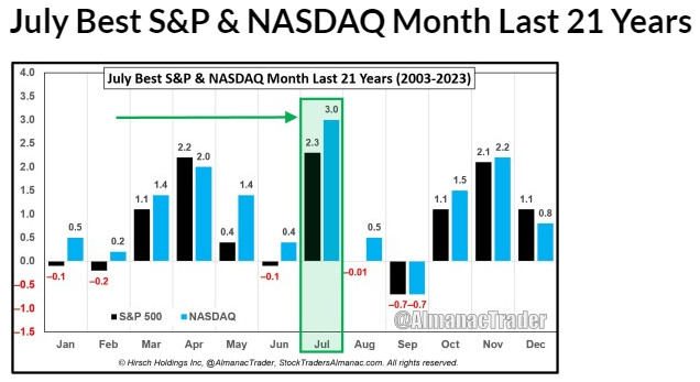
And the winner for the best investment month is July…
Again, if you have not yet read last week’s Market Outlook, go back and review it. Especially the charts that dealt with the historical returns of July.
To reinforce the July narrative, we have taken information provided by our friends at Stock Trader’s Almanac (Jeffrey Hirsch), who have provided additional information below regarding the returns for July from the past 21 years. See below:
On average, over the last 21 years, nearly all of July’s gains have occurred in the first 13 trading days. Once a bullish day, the last trading day of July has had a bearish bias over the last 21 years. In the election years since 1950, July has tended to be a dull month filled with choppy trading.
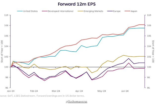
Last week, we mentioned that one of the reasons we believe the stock market has performed so well is due to the earnings of the S&P 500 companies coming in well above expectations. We have also commented that until earnings turn flat or begin to decelerate, it is unlikely that the market will nosedive beyond a normal correction. See the following data commentary and graph that follows:
Global earnings trends. “Forward earnings expectations are up 8% in the U.S. and Japan, while other regions have seen more muted upward revisions (improved trajectory since mid-April though).”
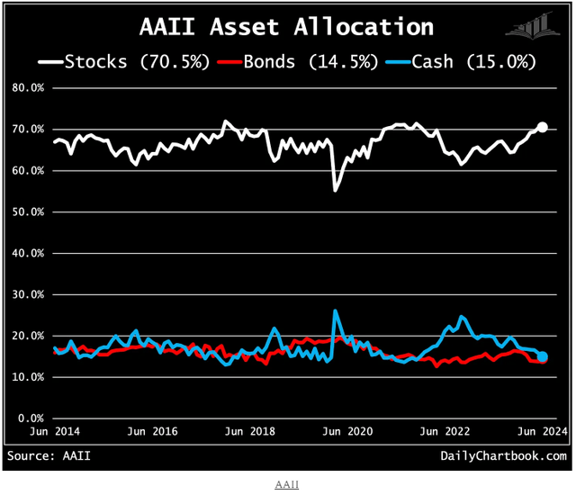
And the winner is… the retail investor, according to the latest data from AAII (American Association of Individual Investors). Retail investors have been putting their investable assets into the market. See note and chart below:
AAII asset allocation (I). Retail investor stock/cash allocations are at their highest/lowest since November 2021.
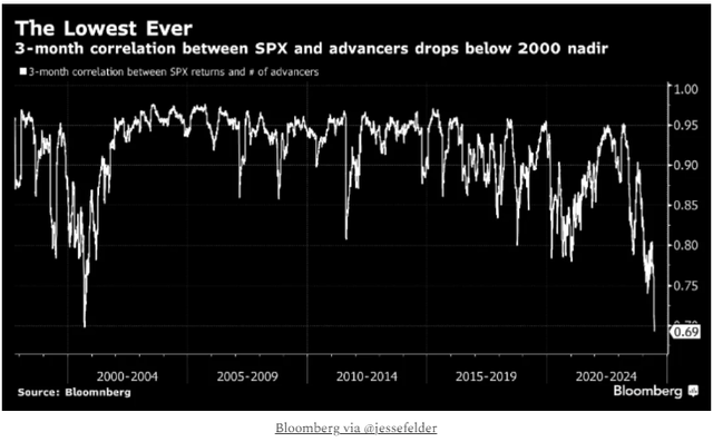
Lots of winners, as shown above. However, there are a number of concerns that still plague this market. Many analysts and Wall Street managers continue to talk about how unhealthy the markets are with just a few issues, as referenced above, driving the stock market’s return. We call this negative breadth, and numerous sources believe this is setting the market up for a near-term potential correction.
To represent both sides of the narrative, we provide some commentary and a few charts below that summarize this concern in more detail.
Relative strength comparisons (I). “We all know breadth isn’t supporting the current market action… but key intermarket ratios are also not.”
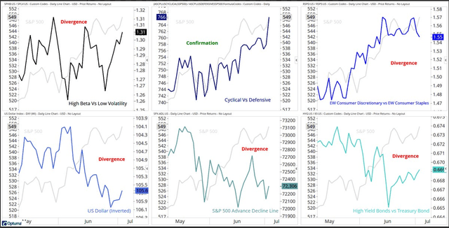
Performance vs. breadth. “The 3-month rolling correlation between SPX returns and the number of advancers is at an all-time low. The only period remotely resembling what we’re seeing now came in 3Q of 2000.”
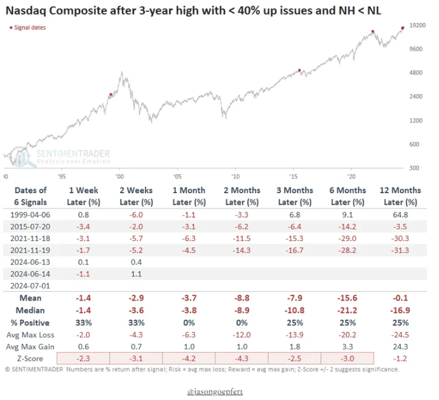
Nasdaq highs vs. lows. “This is not a healthy market. The Nasdaq Composite scored another new high on Monday. But fewer than 40% of stocks advanced, and there were more new lows than new highs. It joins only a few other sickly markets as precedents.”
But the winner is that historically, there are bright spots in the overall market, which leads Ryan Detrick of Carson Investment Research to continue to write that we should see additional new highs soon.
I have provided his narrative below along with some important charts/graphs that you may wish to consider for your overall investment plan for the markets.
New Highs.
One of the key indicators that both Ryan and our own models rely upon is new highs. As he so precisely put it, new highs often lead to more new highs. (A healthier market as opposed to some of the charts/graphs you reviewed above.)
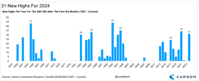
During 2024, there has been a persistent number of new highs. Remember that all of 2022 and 2023, the S&P 500 make a whopping total of one new all-time high. So far, there have been 31 new all-time highs for the first six months of 2024. This year is second only to 2021 in this millennium. See chart below:
What does an abundance of new highs mean?
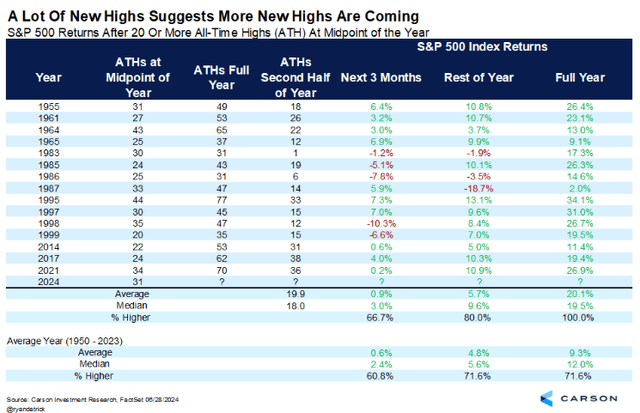
When the S&P 500 had 20 or more all-time highs at the midpoint, the rest of the year has always had at least one more new high. In actuality, the market averaged another 20 new highs the second half of the year.
Turning to returns, the median rest of the year return had a very impressive 9.6%. This is well above the median return for all years of 5.6%. This means that we could very likely see more new all-time highs during the remainder of 2024 and a continued profitable period for all those retail folks participating in the markets (as evidenced above). See the chart below of what historically has occurred when we have this many new all-time highs so far in the middle of the year:
And the winner could be? You, the investor.
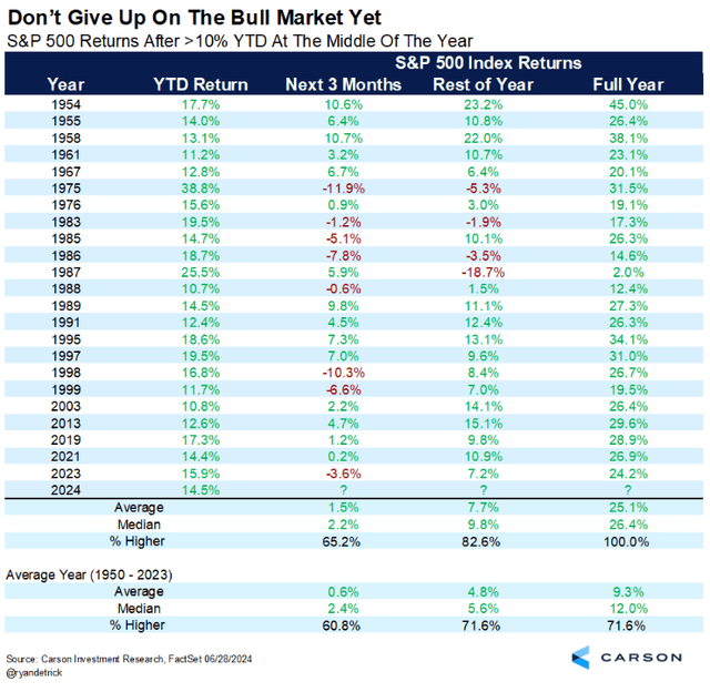
Last, when the S&P 500 was up double digits at the midpoint of the year, the second half of the year did better than most years. In fact, the full year has never been lower, with an average gain of 25% for the entire year. The final six months tend to have a very impressive median gain of 9.8%, when the first six months are well above 10%. More importantly, the second-half returns are well above the returns of all years and have been higher nearly 83% of the time. See final chart below:
I now turn it over to Keith and his team to cover the BIG VIEW bullets.
Thanks for reading. Wishing you a good, profitable and enjoyable week ahead. Stay safe out there!
Risk-On
- Price charts for SPY and QQQ are very strong, showing main indexes outside the upper end of the Bollinger bands though not quite setup for mean reversion in Real Motion. (+)
- Sector rotation had more participants on the upside, led by technology and consumer discretionary. (+)
- Market internals turned up modestly to marginal positive territory. Could see mean reversion with divergences in the oscillator relative to previous highs. The Nasdaq cumulative advance-decline line is sitting just off the lows, setting up for a possible divergence. (+)
- Significant improvement in the New High New Low ratio for the S&P 500 with everything stacked and positively sloped, as well as strength in the Nasdaq. (+)
- Color Charts are giving a full bullish signal for the Nasdaq (+)
- Volatility languishing at lows. (+)
- Growth stocks increased their relative outperformance as we hit new highs, while value remains in a warning phase. (+)
- Emerging markets improved significantly while more established foreign equities moved back into a bull phase. Emerging markets looking to take out its 200-week Moving Average for the first time since early 2022. (+)
- Copper broke out to a bull phase by Friday’s close and is now outperforming the S&P based on the MarketGauge triple play indicator.
- Across the yield curve, by the end of the week, things improved their phase but remained contained in their recent ranges. (=)
Neutral
- Significant divergence in small and midcaps, closing lower on the week contrary to the other indexes and closing in weak warning phases. (=)
- Volume patterns improved to a neutral reading. (=)
- Metals caught fire this week with silver, palladium, and gold miners leading higher, all up well over 6%. (=)
- Confused read with Color Charts (a moving average of the number of stocks above key moving averages) giving a mixed signal for the S&P 500. (=)
- Risk gauges backed to a neutral due to the strength in gold. (=)
- Gold had a significant week and looks poised to take out its all-time highs, about 2% away and is outperforming the S&P 500. (=)
Risk-Off
- Solar, a risk-on sector, got hit for primarily political reasons. (-)
- IWM and S&P continue to deteriorate on the percentage of stock above key moving average. (-)
- Modern family was mixed, with 4 out of the six members moving back into warning phases. (-)
Editor’s Note: The summary bullets for this article were chosen by Seeking Alpha editors.
Read the full article here